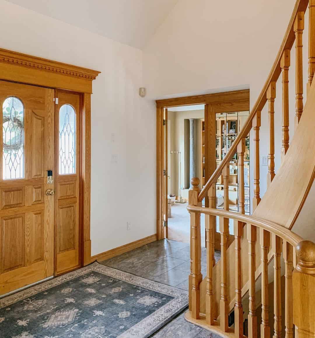
While the Honey Oak hue might have been a cult favorite in the early 80s and for a decent part of the 90s, this interior decor fad has long fizzled out, reducing Honey Oak cabinets into a quaint relic and lacquered door trims into an inconvenience.
If you are looking to breathe life back into your honey oak trim there are a plethora of colors that could be a perfect fit; these colors range from Sherwin Williams Repose gray, Homburg gray, and Benjamin Moore’s antique jade and moonshine.
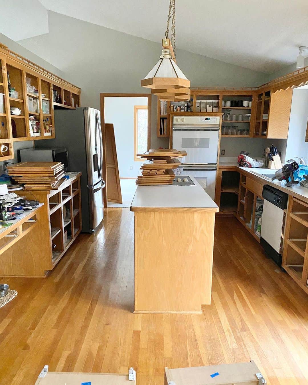
New homeowners often desire an expensive overhaul of honey oak finished elements. However, homeowners don’t need to remove existing elements to add a modern zing to their kitchen or doorway. In this article, we explore color theory, provide pointers on the right way to create a color palette, and then outline the best colors that harmonize with your Honey Oak trim, creating a modern chic look without breaking the bank.
Paint Colors That Go With Honey Oak
While developing the right color palette might seem like the most daunting part of reworking existing honey oak elements, picking out the right paint color might also be a little overwhelming for DIY- homeowners and amateur decorators alike.
Understanding Color Theory
Although the color theory might be easy to overlook, it is, in practice, a fundamental part of most design processes, featuring in everything from artists’ paintings and graphic designer’s logos to photograph compositions and interior design schemes; not to mention that they also provide a great way for decorators to harmonize their designs and develop room color ideas.
The color wheel is composed of three concentric circles with the outermost looping from primary colors through to tertiary colors, where secondary colors are a combination of two primary colors and tertiary colors, a mixture of one primary color and a secondary color.
In this section, we reveal the paint colors that best complement your honey oak trim.
1. Homburg gray SW 7622
With its green and greenish blue undertones, the Sherwin Williams Homburg gray isn’t just a great way to add depth to your living room area; this neutral hue also provides a great balance for Honey Oak orange trim, creating a modern harmonized feel to the doorway.
2. Sherwin Williams Canvas Tan SW 7531
With an LVR of 64, the beige hue comes with a yellow undertone and a creamy finish. It also comes with a creamy backdrop which remains mostly neutral and muted.
3. SW Lemon Grass 7732
This yellow-green Sherwin Williams hue has a relaxed, warm tone that inspires a glow in your kitchen or dining room. This paint comes in earthy tones, which is great to help
effect a seamless, harmonious finish with your honey oak trim. Paint your rooms with the SW lemon grass, and watch your living area light up with a natural glow.
4. SW Kilim Beige 6106
Like its canvas tan counterpart, Kilim Beige 6106 belongs to the yellow hue family. This Sherwin Williams color comes with an orange-pink undertone, perfect for complementing honey oak’s orange tones.
The Kilim Beige is one of the most versatile paints, suiting a wide range of interior design needs. In certain lights, the Kilim Beige hue might appear light, and when contrasted by greens or blues, their orange-pink undertone appears even more pronounced.
5. Oyster Bay SW 6206
This classic green hue is particularly great for creating a timeless effect. It comes in a cool tone which could appear blue with the right element in the room.
With an LVR of 44, this paint is known to reflect light, appearing even brighter in certain lighting. Largely viewed as an excellent pick for your bedroom, the Sherwin Williams Oyster Bay is perfect for everything from too-small rooms to their larger counterparts.
6. Believable Buff SW 6120
This wheat-tinted color is known to infuse warmth into rooms and bring light into otherwise dingy crevices. SW Believable buff appears to show yellow-beige undertones, creating the perfect effect with the orange tone of the honey oak trim.
7. Sherwin Williams Loggia SW 7506
Unlike most tan-colored paint, Loggia isn’t traditionally overtly warm; this hue usually favors a more subtle yellow undertone as opposed to the strong orange undertone. When paired with honey oak finished elements, the color presents a great harmony for honey oak elements.
8. Sherwin Williams Repose Gray SW 7015
Repose Gray is a cult favorite, typically lauded for its LVR and style versatility. This paint is a mostly gray hue tinged with beige, gray, and a small dash of purple. Its undertones are a mixture of brows, greige, and a touch of purple. In repose gray, the purple tint prevents the hue from coming on otherwise dull.
9. Balboa mist OC-27
This is the perfect greige color known to emphasize the light in large and open spaces, inspiring an airy effect. In properly lit rooms, this Benjamin Moore paint is seen to favor light warm tones, even reflecting purple in north-facing rooms. This warm-toned hue doesn’t just make a great combo with cooler grays; it also pairs off nicely with honey oak finishing, creating a great contrast.
10. Abalone 2108-60
Like most neutral colors, the Benjamin Moore Abalone is a versatile, easy-to-use paint. It comes in an LVR of 61.99 and an undertone of purple. These purple flashes, however, are somewhat more peculiar than any greige color—the undertone might come out hue pink.
Albanone allows for a great variety of decor styles, providing the perfect backdrop to everything from a sophisticated effect to a rustic feel.
11. Moonshine 2140-60
Although this near-neutral hue might come off as a cool tone gray in certain lights, this paint color is mostly determined by elements existing in the background. In sufficiently lit rooms, however, the Moonshine might come out a neutral gray in certain lighting.
12. Providence Olive HC-98
This medium taupe hue comes in a blend of green and brown. This neutral color is a part of the historic collection known to elegantly harmonize existing tones and provide a timeless finish. While the Providence Olive might fit perfectly on door trims and window frames, its brown undertone is known to set off honey Oak orange just right.
Choosing the Right Harmonious Palette
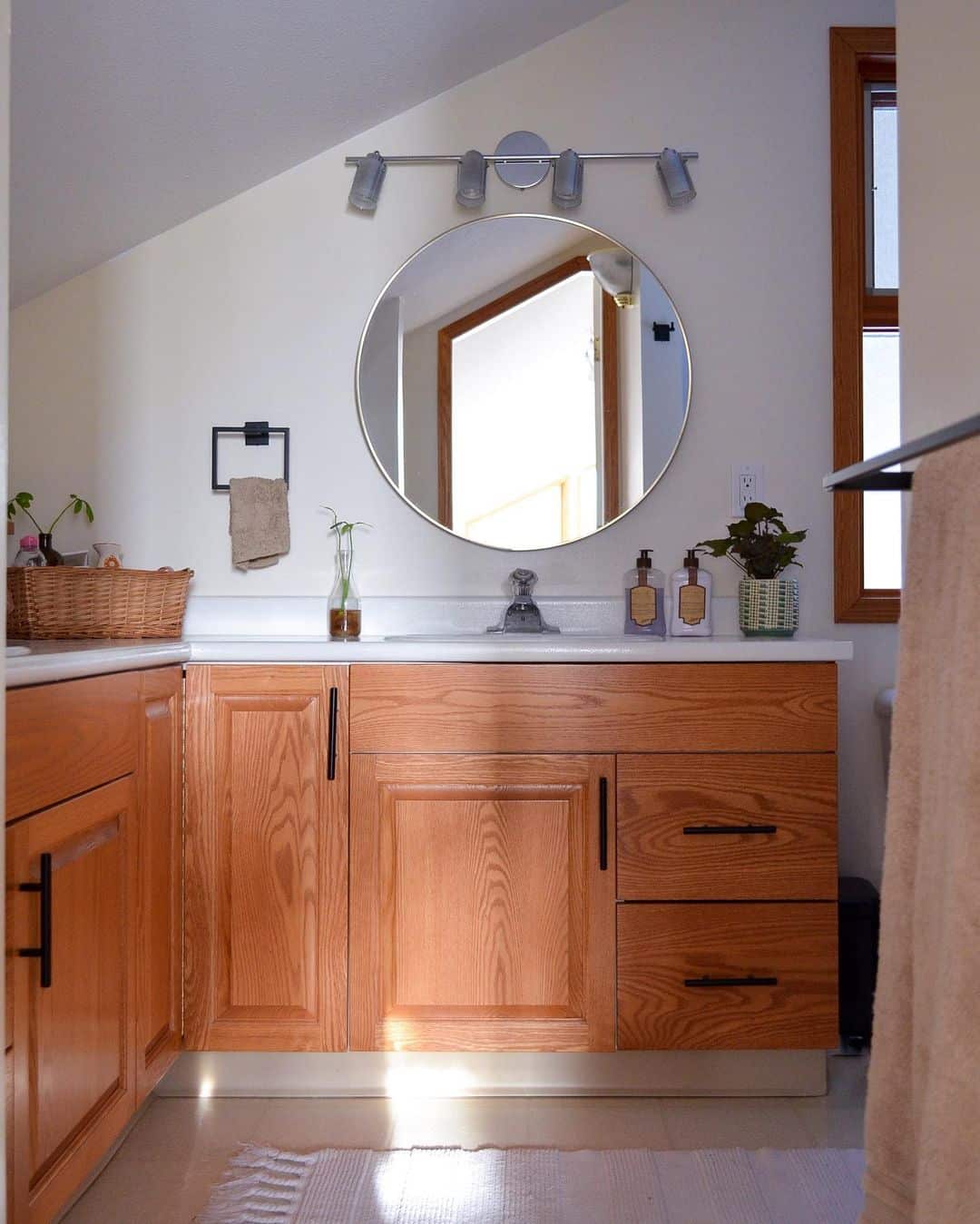
In reworking general, already-existing design elements, you’d need to decide if you want to neutralize their aesthetic or enunciate their effect— and redesigning honey oak-colored trims is no different.
Known for its grainy effect and strong orange undertone, Honey oak requires designers to either develop a harmonious palette using a strong orange-undertones hue or incorporate some strong opposite colors to create a contrasting palette.
There are several ways to create a harmonious effect, but in this section, we highlight the best ways to create a harmonious color palette for everything from honey oak cabinets and honey oak door trim.
1. Analogous Color Harmony
A mixture of colors sitting adjacent to one another on the color wheel gives an analogous harmony, where the honey oak elements have adjacent colors such as red, yellow, and orange. Depending on the order in which the primary, secondary, and tertiary colors sit, analogous palettes are typically a blend of one of their counterparts.
2. Complementary Color Harmony
Here, color harmonies are created by selecting colors opposite to each other, consisting only of primary, secondary, and tertiary colors. These colors tone down and impose balance in your design. For honey oak, you’d want to fade the orange accent in your trim, embracing intense blues–think indigo blue.
Final Thoughts
Although trends might seem short-lived, they typically leave a lasting effect on, and in this scenario, our door frame. Honey Oak isn’t necessarily a bad idea. They just aren’t too popular in the 2020s.
However, fads never die; they exist in a loop of immediate trends and their wilting predecessor. That being said, we recommend exploring complementing interior decor themes as opposed to pricey, more permanent renovations.
N.B: In the event, you can’t get any of the paint colors recommended here, you can make your selection by identifying the paints which create a contrasting or analogous effect.